Clean and clear typography
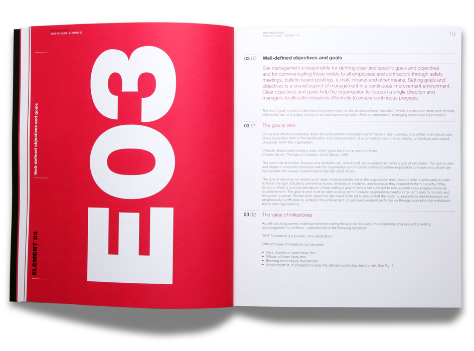
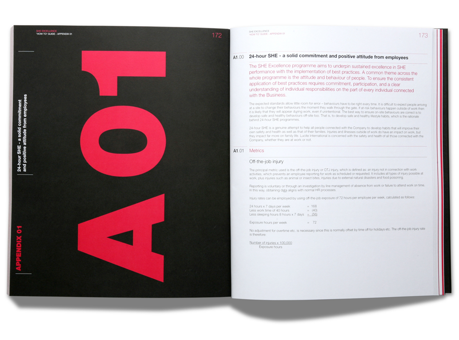
With no imges and only two colours to play with then page design and clean and clear typography is key to producing this highly technical document.
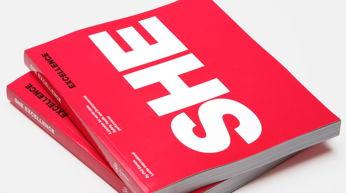
The ‘SHE’ Book, Produced by Lucite International, is a comprehensive guide to best practice regarding Safety, Health and Environment issues. We worked hard to ensure this reference tool was clear, logical and coherent. This meant giving particular attention to layout, font choices, typography, document grid, citations and indexing.
Safety, Health and Environmental performance is the number one priority at Lucite International so it was especially important that this document delivered in terms legibility and of ease of use.


